What is the best way to configure lightning page layouts in Salesforce?
My recommendation is to expose as much information as possible without clicking or scrolling while not sacrificing too much load time. Everything a user needs should be immediately available, they shouldn’t have to remember where something is, it should be instantly available when accessing records.
Below are a few things to avoid and a few to add to maximize your Salesforce experience.
AVOID
Identical Page Layouts
Identical layouts are problematic. While consistency of field placement and functions is important, it can sacrifice productivity as different types of records require different touchpoints and data focus. Some are activity focused with limited fields (Leads/Contacts), while others would greatly benefit from having related lists exposed without tabs hiding the information (Opportunities/Orders), others need prominent Chatter exposure (Cases). Each object has it’s own optimal configuration and sticking to a specific layout for consistency sake is immediately convenient but long term reduces productivity as unnecessary clicks are required.
Hidden Information the productivity killer (In my opinion)
Tabs and Accordion bury information. In my opinion if the information isn’t important enough to show when the record loads, it likely need not be on the page in the first place. Often times using tabs isn’t substantially helpful performance-wise, but exposing information without clicks is a time saver.
Mobile First Design
Let’s be real, users of Salesforce don’t access it on their mobile device. Real work is done with a physical keyboard and 14+ inch screen. Sure, make it mobile friendly but not at the expense of the day-to-day heavy users.
White/Wasted Space
Too much blank space is a productivity killer, it forces more scrolling and searching. Cut down the waste by selecting the layout template that maximizes the object’s information.
PURSUE
Design Page Layouts on a Laptop Screen
End users operate on a variety of devices, but the most common is a laptop. By configuring lightning page layouts on a smaller screen ensures the design will work well regardless the setup.
Related List Quick Links
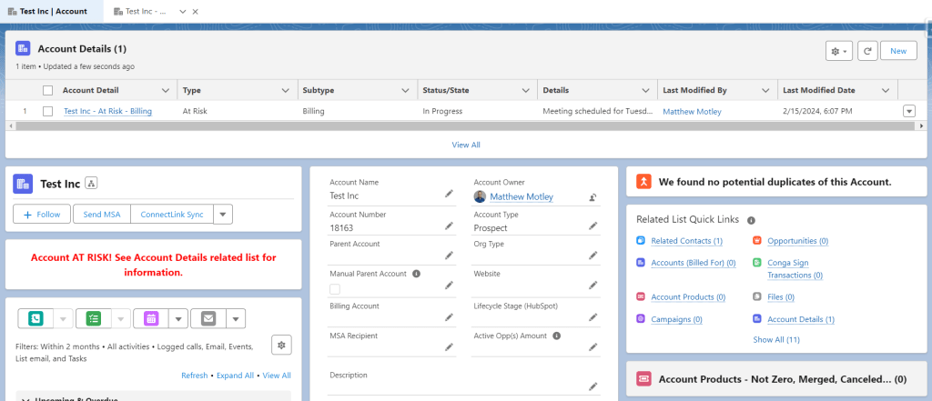
Taking up minimal room and quickly exposing the related records with up to 10 columns of detail, Related List Quick Links is a MUST for highly productive orgs. Also, they load extremely fast, a win win!
Optimal Layouts
Place the most used/useful information in the top left corner or at the very least at the top of the screen. This is where the subtabs will appear in Console apps (if you’re not using console apps, I HIGHLY recommend it), go from important information to related records quickly.
Expose as Many Buttons as Possible
The default lightning page layout has 3 buttons showing, most objects have more. Bump that number up to make the most important buttons available without an addition click.
CHATTER – CHATTER IS KEY, CHATTER IS KING
If you want better adoption, you NEED Chatter on records. Keeping the conversations about a record, in the context of a record is a huge time saver. PLUS then the record stores the conversations, nobody is left out of the loop and business moves smoothly. Auditing and troubleshooting is a relative breeze. Chatter usage is a key indicator of system adoption and if users cannot see it right away, business slows.

Leave a comment